Taking the Informa brand into a new Orbit
As a FTSE 50 Group after the acquisition of UBM, Informa chose Luminous to create a fresh brand experience that was meaningful to both customers and colleagues.
We asked Luminous Director of Brand and Comms, Sheila Morrison, and Creative Partner, Jon Towell, to outline how Luminous helped create a new brand platform that united a diverse international team, a brand architecture that made sense of the enlarged Group and presented a clear customer offer, and a digital-first visual experience that captured the dynamic spirit of the business.
Why did Informa need to rebrand and what were the key objectives?
JT With the acquisition of UBM having such a large influence over the scale and structure of the enlarged Group, it was the right time to review the brand and change the way Informa presented itself to the world. The business had changed enormously from the last time they looked at the brand identity five years ago.
The Informa team took the opportunity to review pretty much everything across the brand spectrum apart from the logotype, which carried so much equity. It was also the ideal time to decide on the most meaningful brand architecture for the Group – whether they should embrace a branded house approach, which would bring the Informa name to the fore by introducing it consistently at divisional level for the first time.
Post the UBM acquisition, which was internally known as ‘The Combination’, Informa needed to align and unite all their international colleagues around a consistent brand platform, so asked Luminous to develop fresh values, external and internal propositions, define the right brand personality and articulate a new brand purpose.
Creatively, it was time to bring the brand identity up to date for the digital world that most of Informa’s products live in. The brand experience needed to be more agile, flexible and reflect a dynamic and connected world.
What was the thinking behind the new brand architecture?
SM One of the first rebrand workstreams that we focused on was looking at Informa’s brand architecture. With the UBM combination, the internal structure had become increasingly complex, with five divisions and a ‘bolt-on’ UBM. Some of the divisional titles carried the Informa name (e.g. Informa Exhibitions) while others went to market as independent brands (e.g. Knect365).
Brand architecture is essentially about reflecting the customer’s point of view in an outside-in versus an inside-out perspective. We started the architecture process by mapping out the status quo and identifying all the issues at a master brand, divisional and product level. We then identified different scenarios and naming implications, analysing all the pros and cons of optional structural scenarios along a spectrum. At one end of this spectrum we had ‘branded house’ and on the other side ‘house of brands’. And, of course, we had all of the other potential iterations in between.
While the house of brands approach, with bespoke divisional naming and sub-brands, would potentially provide greater flexibility to tailor divisional offers, the downside was that it moved the customers’ relationship with the Informa name even further away from where it stood currently. Creating a house of brands would also make the Group feel more disparate to colleagues at a time when alignment and unity were the key objectives.
As we developed the branded house approach, it became obvious that this more directly met the overall objectives of the rebrand. This type of architectural approach means that the company is the ‘brand inside’ and all of the divisions, the products and the services should carry the company’s name. In Informa’s case, we established a brand architecture with a divisional structure of Informa Markets, Informa Intelligence, Informa Tech and Informa Connect.
This approach built on the existing equity of Informa, created consistency and simplicity across the divisions and also drove cost efficiencies as we didn’t need to develop a number of divisional brands. Ultimately, adopting a branded house met the most important rebrand challenge – to create a sense of unity across this international and diverse organisation and help Informa become greater than the sum of its parts.
How did you go about developing a meaningful brand platform?
SM The development of a brand narrative and a distinct proposition was an iterative process between Luminous and Informa, with Informa Chief Executive Stephen Carter involved heavily in the direction and development of the purpose, propositions and guiding principles.
As the combination with UBM involved 3,500 new colleagues joining the Group, the initial challenge was one of cultural alignment. Working with our ‘culture insight’ partner, The Culture Consultancy, we undertook a two-month discovery and assessment stage to help us understand the cultural landscapes before the combination and highlight existing perceived differences between Informa and UBM colleagues. The assessment integrated findings from four sources:
– Stakeholder interviews, with 40 executives and senior managers;
– 14 focus groups, segregated by company, with around 150 anonymous participants;
– An Intranet survey, where 1,876 colleagues gave quantitative and open-ended feedback;
– Existing documentation and internal reports.
The culture assessment revealed 10 imperatives and four priorities against which Informa needed to establish clarity and achieve alignment throughout the organisation. These objectives provided the fuel needed to drive fresh thinking around the new corporate purpose, vision and values.

How did you define the right positioning for the larger Group?
SM As part of the discovery stage, our brand strategy team undertook a competitive audit of existing peer positionings. The audit flagged up the fact that while direct competitors positioned themselves as functional ‘providers of information and data’, indirect competitors communicated a bigger purpose, positioning themselves as transformational players and ‘change agents’ in their space, with clear points of view on global trends.
Based on these findings, we evolved three potential brand territories that Informa could credibly own and debated which positioning best captured the direction of the business. The spectrum ranged from a territory focusing on unrivalled expertise and specialism, to one capturing a pioneering spirit that was shaping new markets.
How did the big idea of specialism evolve?
SM With Informa and UBM having existing guiding principles and commitments, developing a fresh set of values for the combined business was key to the cultural alignment challenge. The discovery stage provided insight into existing shared beliefs and behaviours, but the new guiding principles also had to be future-proofed to represent where CEO Stephen Carter was taking the business.
Having selected broad themes for each of the new principles, our brand writer, Joe Coleman, developed a number of narrative options reflecting different tone-of-voice approaches. The four new principles, ‘Think big. Act small’, Trust must be earned’, ‘Success is a partnership’ and ‘More freedom. Fewer barriers’ highlighted an enterprising, collaborative and agile business.

What was the creative approach to the rebrand?
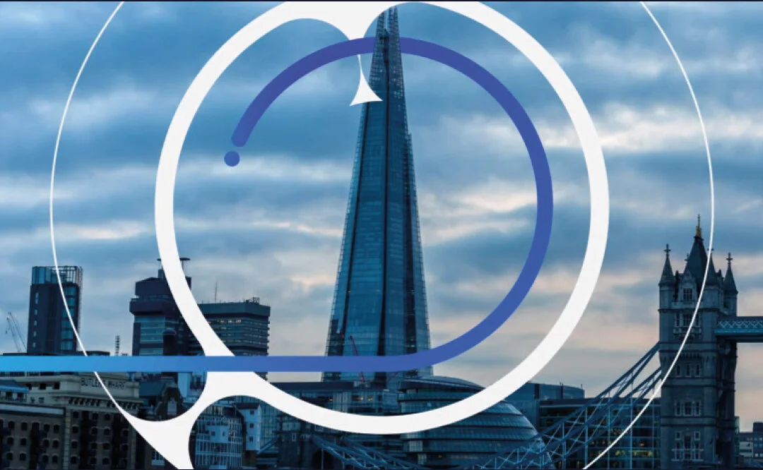
JT The visual expression of the previous Informa brand was built around a circular ‘portal’ graphic, which had created a distinctive identity, but had largely been implemented across printed collateral. In the initial creative exploration stage, we focused on how we could evolve the spirit of the ‘portal’ into a more expansive digital-first brand experience.
We used animation and movement to develop a more agile and interactive experience, creating something that people could engage with across a range of digital applications. We developed a new graphic ident, which we called the ‘Orbit’, which, when aligned with the legacy logotype, created an identity which reflected Informa’s strength of history and embraced its future opportunity as a dynamic and innovative business.
With well over 100 individual pieces of collateral to develop, the strength of the creative idea lay in the agility of the ‘Orbit’ graphic to be flexed in varying ways across different forms of brand communications.
In moving image, the animated ‘Orbit’ device was used as a dynamic graphic that colleagues could interact with. The graphic shapes (curves and dots) that make up the ident were utilised as individual elements to mask or hold imagery in marketing collateral and print publications and were used distinctively across office signage, products and merchandise. The individual graphic elements were repurposed as a grid system that was adopted for signage, carpet patterns and meeting room manifestations as the brand was applied within the interiors of Informa’s international property portfolio.

A fresh colour palette was developed to promote the strength of the branded house Group structure, with two legacy blues positioned as the primary colours across both Group and divisions. This carried over a sense of equity of the existing Informa brand. We then created a suite of vibrant accent colours to ‘code’ each division, which were selected so they really ‘popped’ against the primary blue. The fresh colour combination was a more forward-thinking system when working cross-channel on screen and in print.

Our objective of evolving the brand into a digital-first experience meant utilising a fresh set of open fonts, which would be easily available for colleagues around the world to use consistently across all channels without compromising to ‘default’ fonts. The two font families we chose, Aleo and Open Sans, work particularly well on screens as they are designed to be legible when used in small sizes, such as on mobile devices. The font choice enabled us to bridge the gap between all of the typical Microsoft applications and printed collateral, such as the sustainability and annual reports, so the entire suite of collateral presents a joined-up visual experience.

How do you see the brand evolving creatively?
JT The core ethos of our approach was to develop something that could constantly evolve. It’s a brand that doesn’t stand still, with the agility to move on as the company progresses.
Despite being a digital-first approach, the concept has the flexibility to be introduced across core printed publications such as the Sustainability Report and the Annual Report, where we weaved the ‘Orbit’ graphic into illustrations and infographics to present a distinct brand experience to corporate audiences.

Jon Towell
Creative Partner
Luminous

Sheila Morrison
Director of Brand and Comms
Luminous